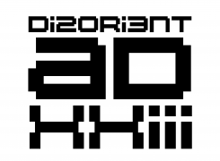
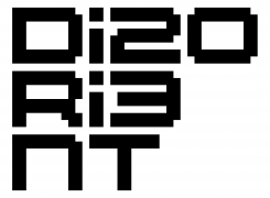
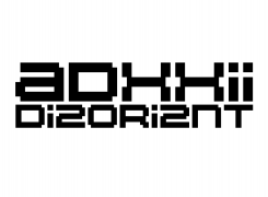
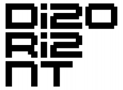
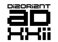
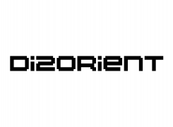
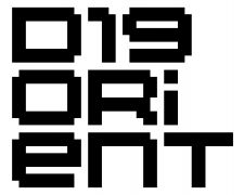
Disorient logo
Use of Disorient Logo
The Disorient logo is used on our Signs, D-shirt, Urn, Disorient Pattern, etc. Every Disorient camper is encouraged to use the Disorient logo and the Disorient font for Disorient-related projects.
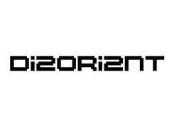
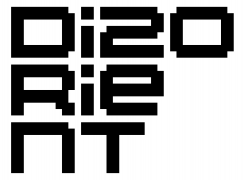
Disorient logo and fonts should not be distorted in X or Y. Space between each 8 point letter should be one point (for instance if letter is 8 pixel tall, space between letters should be 1 pixel). The proportions of the letters, kerning, etc. should remain as shown on this page. Contact The Eye with questions.
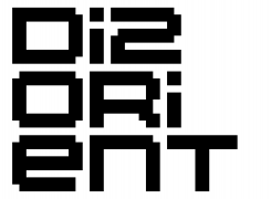
Disorient Logo (Generic)
Fonts and Typefaces
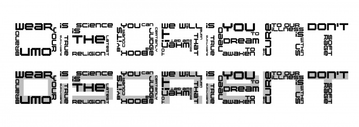
Disorient Word Font (2019)
Letters made of sentences using Disorient 2017 font as a base.
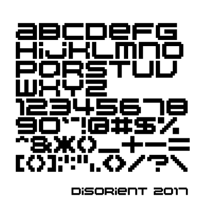
Disorient 2017
The "Disorient 2017" font (designed by The Eye and programmed by Jacob J.) is an update and a simplification of the Disorient font. In an effort to make the font more legible while keeping its distinctive character, many letters have been fine-tuned. Also, both upper and lower cases display the same character, so you really can't go wrong. We encourage the use of this font over previous versions.
(Disorient 2017 font family) "This is an experimental version. It doesn’t validate when installed, but OS X will allow you to override it. There a few things broken with it but as long as you stay within the disorient character set you should be fine for now." -Jacob J.
(Github) (if you need to use the Disorient 2017 font for programming i.e. Disorient LED Signs)
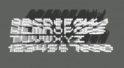
Disorient Shadow font (2016)
by The Eye
for Disorient Hong Kong


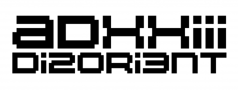
Disorient Bedouin Tech font (2014)
by The Eye
Designed especially for Bedouin Tech in 2014 (the year we launched our Dubai event), this font is used for the Disorient Dubai Sign and on Disorient Dubai artifacts. Similar to the idea of adding the year to the Disorient logo, the origin of a photo is immediately identifiable thanks to this font. In 2015, the Bedouin Tech logo was extrapolated from this font.
This font is available as part of the Disorient 2017 font family.
Disorient 2012 font
by The Eye
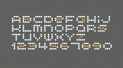
The Disorient 2012 font is a significant departure from the previous versions of the Disorient font. The goal was to create a 4-point font while remaining true to the overall proportions of the Disorient font. Although some characters had to be drastically modified, this transformation was possible since most characters in the Disorient font are 8 pixels tall by 10 pixels wide, both dimensions resulting in a natural number when divided by 2.
To make Disorient 2012 more legible we bent the rules by moving some "pixels" halfway between two points on the underlying grid. Those pixels are highlighted in orange below.
The Disorient 2012 font was used for Disorient Low Res Sign and the Disorient Stencil 2013 that you might have seen on our Black Crates
Disorient Dot, Pixel and Diamond fonts
DO NOT USE. FOR REFERENCE ONLY. PLEASE USE DISORIENT 2017 FONT.
By Archer and The Eye
The Disorient font family includes the Disorient font, Disorient Pixels font, and Disorient Diamonds font. This font family is presented here for archiving purpose only and should no longer be used.
IMPORTANT. Since 2017 the Disorient logo uses the Disorient 2017 font family which has replaced the Disorient font family.
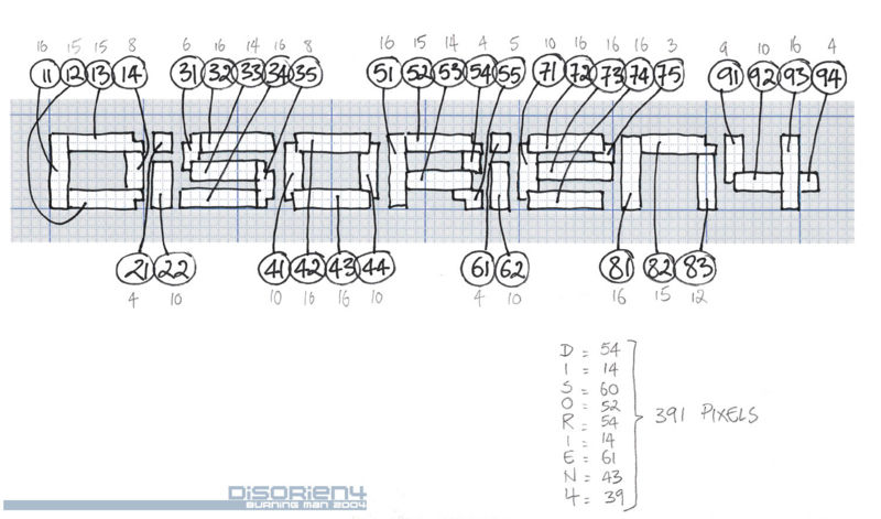
Pixel Count
This diagram is from the original Disorient Sign from 2004. Disorient Signs from other years will likely have different pixel counts.
04b-20 (Disorient Classic font)
created by 04, selected by Leo for Disorient in 2001
Disorient Classic font: 04b-20 (Mac - Win).
Year in logo
Every year letters of Disorient are replaced by the number of years Disorient has been around (which coincides with the last digits of the year). This convention, loosely based on 1337, started in 2004 in order to make years easily identifiable on photos. Below is a list of suggested spellings but there is no "right" place for the number(s) in Disorient so feel free to experiment.
Disorien4
Di5orient
Disori6nt
Disorie7t
Di8orient
Disori9nt
DiXorient (D1s0rient and DIS ORI TEN prevailed)
D1sor1ent
D12orient
Disor13nt
D14orient (changed from Disor1en4 at Jason C's request)
D15orient
Disor16nt
Disor1e7t
D18orient
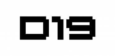
Disor19nt
Di20rient
Di2or1ent
Di2ori2nt
Di2ori3nt
Di2ori4nt
Di2ori5nt
Di26rient
Di2orien7
Di28rient
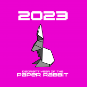
2023
2022
2020
2019
previous years
Disorient Lounge 2000
by Leo
Disorient Lounge 2000 Sign, part of Tranquility Base at Burning Man, the year before Disorient became a camp. An example of the pixel font direction that led to the current choice of font for Disorient.


